At-Rules
This page shows you how to create and manage CSS at-rules in Unblock.
What are at-rules
At-rules are CSS instructions that control when and how styles apply. Media queries (@media), container queries (@container), and feature detection (@supports) are common examples.
In Unblock, you define at-rules as reusable tokens with a name like --tablet-device. Instead of repeating (max-width: 780px) everywhere, you write it once and reference the token by name. Change the value in one place and it updates across your entire site.
The At-rules panel
Open the Unblock modal and switch to the At-rules panel. Collections are on the left, and a table on the right shows your rules with their type, name, expression, and preview width.
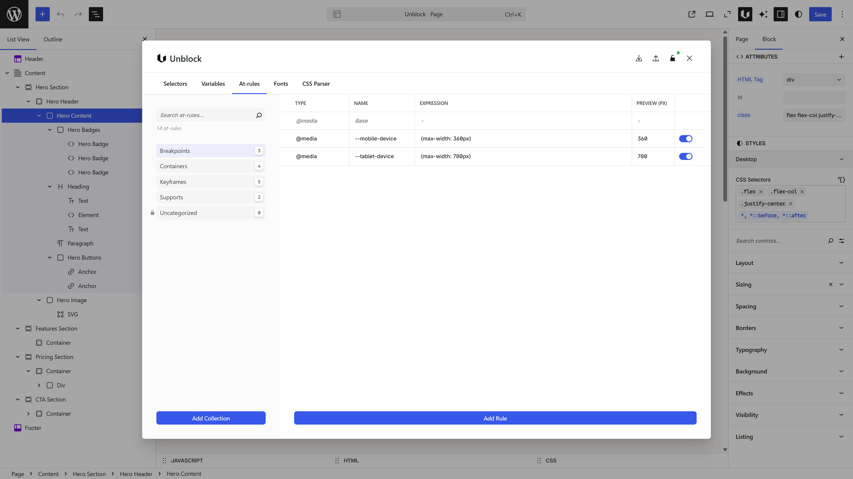
Collections
At-rules are organized into collections by type. In the screenshot above, the user created collections like Breakpoints, Containers, Keyframes, and Supports. Unblock ships with default breakpoints in the Uncategorized collection — create your own collections to organize your rules.
Order matters — at-rules defined later override earlier ones. This determines whether your breakpoints follow a mobile-first (min-width) or desktop-first (max-width) approach. You can reorder rules and collections by dragging them.
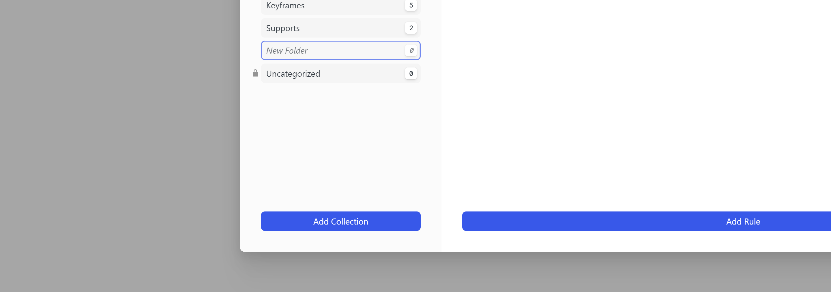
Create a collection
Click Add Collection at the bottom of the sidebar. Type a name for your collection and press Enter to confirm.
Creating an at-rule
Click Add Rule at the bottom of the table.
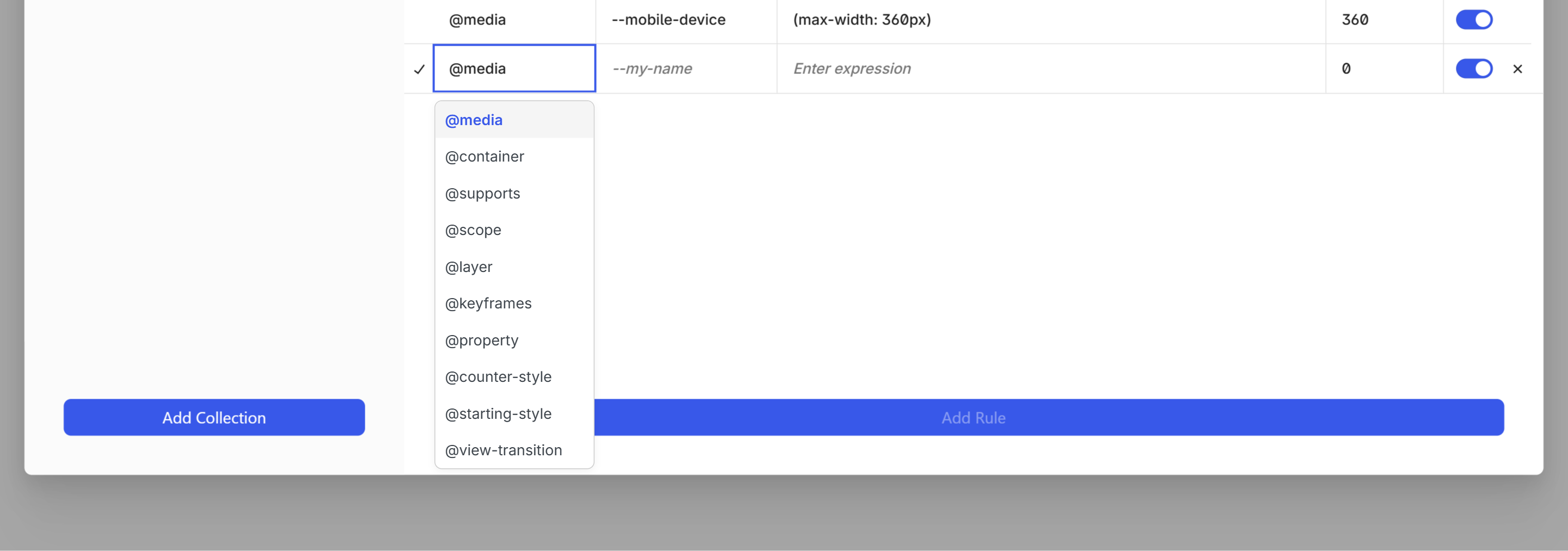
Fill in:
| Field | What to enter | Example |
|---|---|---|
| Type | The at-rule type | @media |
| Name | A token name starting with -- | --tablet-device |
| Expression | The CSS condition | (max-width: 780px) |
| Preview (px) | Width for the editor preview (only for @media) | 780 |
| Toggle | Enable or disable the rule | On |
The preview width is only available for @media rules — it syncs to the closest available WordPress editor breakpoint to match and preview the right styles. The toggle enables or disables the rule entirely — when disabled, the rule won't apply in the editor or on the frontend.
Supported types
Conditional at-rules — define a token with a name and expression, then use it in your selectors:
| Type | Use case |
|---|---|
@media | Viewport-based responsive design |
@container | Component-based responsive design |
@supports | CSS feature detection |
@scope | Scoped styling boundaries |
Named at-rules — define a block of CSS with a custom name:
| Type | Use case |
|---|---|
@keyframes | Animation definitions |
@property | Custom property registration |
@counter-style | Custom list counters |
@view-transition | View transition definitions |
Other:
| Type | Use case |
|---|---|
@layer | Cascade layer ordering |
@starting-style | Initial styles for animations |
Breakpoints
Unblock ships with three default breakpoints that match WordPress conventions:
| Name | Expression | Preview |
|---|---|---|
| Base | — (no query, applies to all viewports) | — |
--tablet-device | (max-width: 780px) | 780 |
--mobile-device | (max-width: 360px) | 360 |
When creating new rules, the expression field offers suggestions — common max-width and min-width values for @media, size thresholds for @container, and feature checks for @supports.
Container queries
Container queries style a block based on its parent's size instead of the viewport. Define container tokens the same way as breakpoints.
The parent block needs container-type: inline-size set in its styles for container queries to work. If your container query isn't applying, check the parent.
Using at-rules
Once defined, your at-rule tokens are available everywhere you write CSS in Unblock.
From the toolbar
In the Selectors panel or CSS inspector, use the at-rule switch in the toolbar to change the editor context. Selecting a token wraps your CSS in the corresponding rule — for example:
@media (--tablet-device) { .selector { ... } }
The Styles panel works the same way — switch to a breakpoint to set styles that only apply at that size.
In the CSS editor view
In the Variables panel CSS editor view, you can override values per at-rule:
@media (--tablet-device) {
  :root {
    --container-width: 750px;
    --font-size-hero: 3.5rem;
  }
}
Next steps
- Selectors — use your tokens inside selector styles
- Variables — override variable values per breakpoint
- Design Tools — understand the full design workflow